Good news for the fourth of July
More on:
The US economy has absorbed its share of blows over the last year:
Jobs have disappeared;
Oil prices have soared;
Consumer confidence is way down;
An important broker-dealer collapsed, prompting the Fed to facilitate the take-over of a very-troubled financial institution by a less-troubled financial institution;
And more financial institutions could have faced trouble absent access to Fed liquidity support.
There isn’t a lot for the US economy to celebrate this fourth of July.
But one thing hasn’t gone wrong.
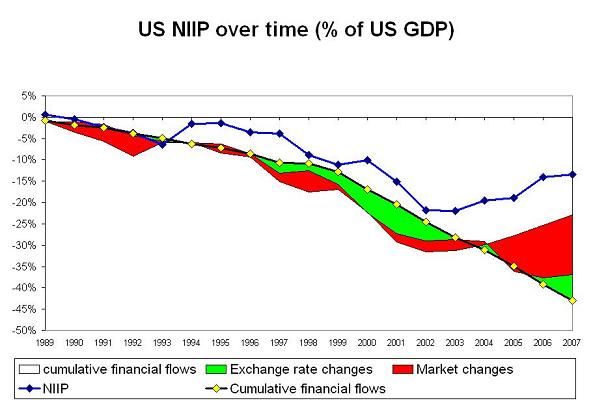
The US net international investment position -- if US direct investment abroad is valued at its market value -- actually improved, absolutely and relative to US GDP.
Source data for the graph
The red and green bars reflect the improvement in the US international investment position from exchange rate moves (the dollar’s fall increases the dollar value of US investment abroad) and market moves (if foreign equity markets rise by more than the US equity market, the value of US investment abroad rises more rapidly than the value of foreign investment in the US) relative to what would be expected from simply summing up financial flows.
Adding in valuation gains doesn’t eliminate the gap between cumulative financial flows and the NIIP. The remaining gap comes from so called "other changes" -- basically a statistical adjustment that reflects the gap between what the assets abroad the US identifies through the survey and cumulative flows and estimated valuation gains. Some call this statistical manna from heaven. Others suspect that the US just isn’t able to count all the US debt the rest of the world holds.
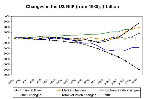
Historically, it has been an important reason why the US international investment position hasn’t deteriorated as much as might be expected. It has a big impact on the 2005 data too. But it hasn’t driven the data since then. The recent improvement reflects exchange rate gains and, above all, the better relative performance of foreign equity markets than the US equity market. This shows up more cleanly if valuation gains are plotted over time in billions of dollars.
Most US debt (and the foreign debt Americans hold) is denominated in dollars. The falls in the dollar don’t generate big valuation changes on the debt side. At least not for the US. The value of US debt has been falling when expressed in the currencies of some of the United States creditors. That is the flip side of US valuation gains. Valuation changes by contrast have pushed up the value of US equity investment abroad relative to foreign equity investment in the US.
A plot of the US net debt position and the US net equity position shows this. The net debt of the US (US borrowing from the world minus US lending to the world) is rising quickly, as the US has financed its current account deficit by placing debt with investors around the world rather than by selling equities to the rest of the world. And the US net equity position has improved -- almost entirely as a result of valuation. Net equity flows have balanced themselves out over time (inflows in the 90s were matched by outflows after the .com crash; more recently the 2005 Homeland investment Act generated inflows that have offset some post 2005 outflows)
Back in 2004, Nouriel Roubini and I anticipated a large deterioration in the net debt position of the US. We didn’t anticipate the offsetting improvement in the net equity position. We didn’t expect the US equity market to perform so much worse than global markets. And we expected more dollar depreciation against Asia (where the US has less foreign investment) and less against Europe. Above all, we didn’t imagine a world where the US could attract large inflows on a sustained basis despite offering financial assets to the rest of the world that significantly underperformed global markets. Money usually flows to the place where it can get the highest return, not the place that produces the lowest return.
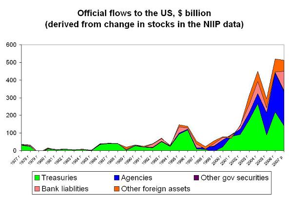
So who financed the US deficit even though the US dollar fell, US bonds paid low rates and the US market underperformed global markets? Well, above all, the official sector. Or rather, the official sector, once the large short-term flows associated with London’s emergence as a major offshore financial center for the US are netted out. The change in the official sector’s holdings over time offers one measure of capital inflows. Using the change in stocks to infer flows risks overcounting, because the rise in the stock will be influenced by changes in equity markets. But the official sector’s holdings of equity markets are small enough that this isn’t a major driver.
Three points are worth making here.
First, the change in official holdings in NIIP in 2007 is a bit over $500 billion, while official inflows in the 2007 balance of payments data are a bit under $400 billion. This isn’t a reflection of valuation gains on official equity investment. Rather it is a reflection of the impact of the 2007 survey on the balance of payments data. The balance of payments data for q2 likely will include significant revisions to the 2007 data.
Second, the composition of official inflows has changed over time, with much larger flows going into long-term Agencies now than in the past. Official demand for equities is also rising. But the rise in official demand for equities in 2007 wasn’t as large as the rise in official demand for short-term bank deposits and similar claims. A few sovereign funds invested in risky financial institutions. But far more official players decided not to take any chances and piled into the safest stuff around. The official flight away from risk could have had a much of an impact on the market as capital injections in leveraged financial institutions; both flows need to be included in an analysis of how the official sector impacted the market.
Third, the 2007 data almost certainly understates true official demand for US debt. The survey only captures the change in stocks through the middle of 2007. Comparable data for the last bit of 2008 won’t be available until the spring of 2009. Official investors increasingly make use of private fund managers to try to get better returns -- and those funds aren’t captured in the survey.
Why I am I fairly confident of this? Well, recorded official inflows, large as they are, are still well below the known increase in global reserves in 2007. And while the IMF’s COFER data has big gaps, the available data doesn’t suggest a shift out of the dollar.
Combine the big rise in reserves and an assumption that central banks who don’t report detailed data to the IMF acted like the central banks who did report data to the IMF, and implied dollar flows are way higher than recorded official inflows to the US. This is also story that helps to explain how the US has been able to attract big inflows despite offering subpar returns. The official sector’s dollar accumulation hasn’t been motivated by purely commercial (or least not purely financial) considerations.
Rather than focus on the resulting risks, though, today I’ll just highlight the result: the United States net international investment position is in far better shape than anyone could realistically have hoped after ten years of large current account deficits.
More on:
 Online Store


